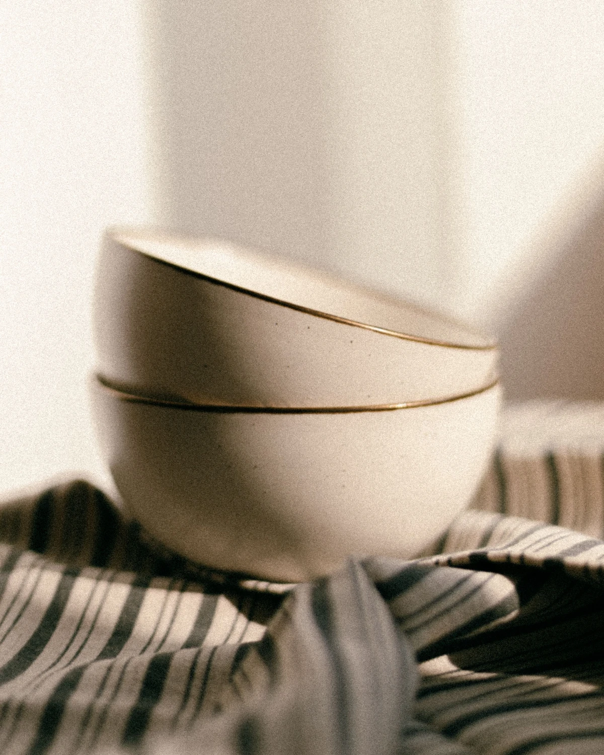
The café light looked lovely, but a filter made the table blue and the white cup orange. You wanted a calmer atmosphere, not a new colour for every object. Snapseed Color Grade offers a different starting point: think about darker, middle, and lighter parts of the photo instead of giving the whole image one blanket treatment.
Google describes Color Grade as a way to tint Shadows, Midtones, and Highlights separately with colour wheels.[1] A tint adds a colour direction. Before combining several colours, decide which part needs a different mood and which parts should keep their familiar appearance.
This is a guide to principles and editing decisions, not a tap-by-tap walkthrough. The feature reference is the Snapseed listing for iPhone and iPad; check the version, layout, and availability on your own device. Do not assume the same controls are available on Android.
Opening photograph: Lidia Bekenova / Pexels License. This is a stock still life of bowls and fabric, not a Color Grade result or SCI Magie customer work.
Snapseed Color Grade: understand tonal targets
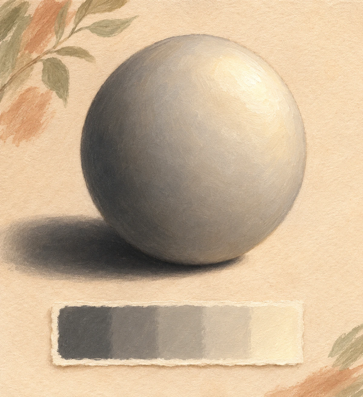
Shadows are the darker areas of a photo, midtones sit between dark and light, and highlights are the lighter areas. Picture a bowl beside a window: its shaded interior, the softly lit ceramic wall, and the rim catching the light. These are ways of reading brightness, not three categories of objects.
One object can span all three ranges. Tinting the shadows is therefore not the same as selecting an entire bowl, hairstyle, or shirt. Nor should you picture tonal ranges as rigid cut-outs with visible borders. The transition across a lit surface is often an important part of the final impression.
Keep this separate from HSL: hue is the colour family, saturation is its intensity, and luminance is its brightness. Adobe distinguishes Color Mixer adjustments to colour ranges from Color Grading adjustments to shadows, midtones, and highlights.[2] The Snapseed listing also describes Color HSL and Color Grade as separate tools.[1]
The practical questions differ. “The red bag is too vivid” points to a colour family. “The shaded areas feel too warm” points to a tonal region. Choose a tool for the actual problem; do not expect a shadow tint to affect only the object you had in mind.
Give each range one simple colour role
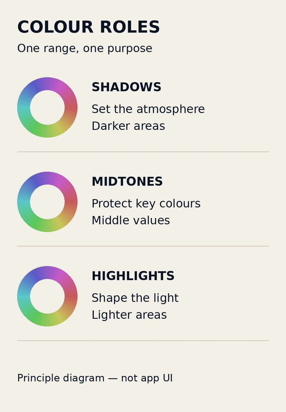
Start with one sentence, such as: “I want slightly cooler shade while the ceramic keeps its natural warmth.” That is more useful than chasing a cinematic label. Colour wheels offer directions for a tint, but the choice still needs to serve the photograph rather than a fashionable combination.
Begin with the most relevant range. Try a small shadow adjustment for the atmosphere in the shade, then look at the whole image again. If that achieves your goal, you do not have to add different colours to the midtones and highlights. Three controls do not require three conspicuous colours.
In the midtones, watch the key colours that carry the story: skin, fabric, food, or the body of a product. In the highlights, consider whether the light still feels believable. Bright areas do not always need a golden tint; in an already warm photograph, more colour may overpower the material and detail.
Look at the meeting point between lighter and darker areas, too. Do they feel like parts of one coherent light, or like two competing layers of colour? The roles in the diagram are a way to think about an edit, not selection boundaries, measured results, or extra Snapseed control names.
Keep skin and objects believable
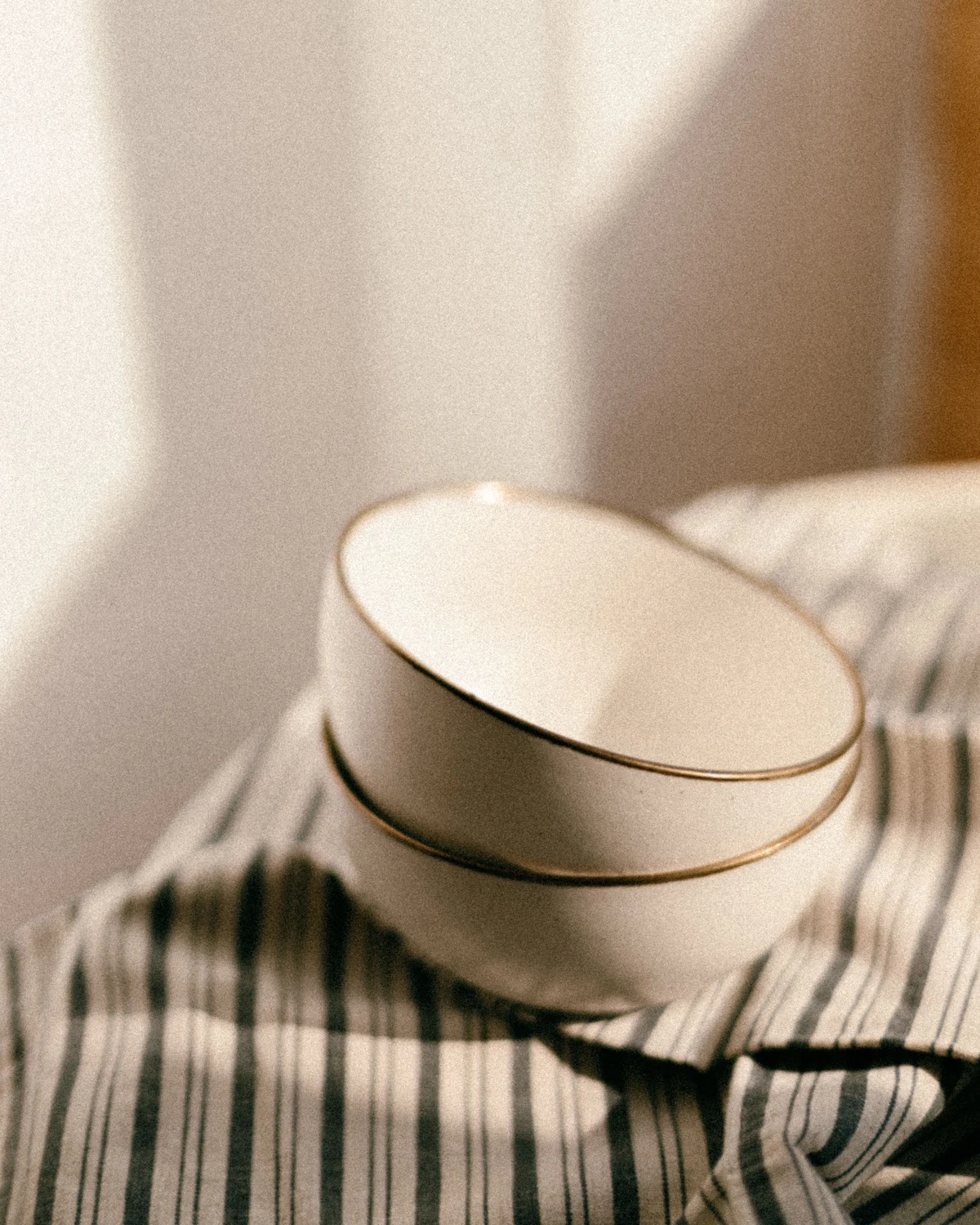
Before deciding you are done, choose a few visual checkpoints. For portraits, look at the face and hands under different light. For a still life, look at pale ceramic, fabric, and the shaded side of an object. A seemingly neutral object can be a visual reference, but it is not a calibration tool or proof of colour accuracy.
Compare the edit with the starting photo at a sensible viewing size. Can you still recognise the materials and atmosphere? If white fabric draws attention because it has become too blue, or skin looks grey, reduce the colour influence and review again. Avoid adding another tint simply to fight the first one.
For product photographs, put the object’s identifying colour ahead of a dramatic atmosphere. For personal photographs, prioritise a mood that suits the moment and the person. Different purposes do not need the same colour combination. One restrained decision can be more useful than three changes competing for attention.
If the colour direction still needs careful balancing, tell SCI Magie what feels wrong and what must remain unchanged. Share how you will use the photo, not just the name of a filter. Powered by Shaniba Creative Industry.
References
[1] Google: Snapseed Color Grade and Color HSL descriptions for iPhone/iPad. [2] Adobe: colour-range and tonal principles in Camera Raw. The Adobe reference explains concepts; Adobe control names and values are not Snapseed instructions.