
A small lamp behind a product can make a photograph feel inviting. Let its glow spread across the product name, though, and atmosphere starts getting in the way of information. Portraits have a similar balancing act: a bright light behind someone’s head can look appealing while the outline of their cheek still needs to read clearly. Before adding an effect, decide what can glow and what must stay distinct.
Lightroom Classic 16 Glow gives you several ways to shape that light. Adobe introduced Glow in its November 2026 release of Lightroom Classic, version 16.0, with different styles and adjustable controls. This guide concerns Lightroom Classic on a computer, not Lightroom Mobile. 1
Bloom and Halation can look related at first glance, but they serve different intentions. Do you want brightness to spread outward, or do you want a warm red-orange fringe around highlights? Understanding that distinction gives you a better starting point than searching for slider values that supposedly work on every photograph.
The visuals are AI-generated concepts, not screenshots, Lightroom editing results, or customer work.
Choose which light source deserves emphasis

Start by looking at the photograph without added Glow. Find its light sources and brightest reflections: a lamp, a glint on a glass rim, or light from a window. Highlights are the bright parts of an image, and they do not all deserve equal attention. A reflection might help describe an object’s shape, or distract from lettering immediately beside it.
Imagine a drink bottle with a small lamp behind it. If the picture needs to communicate the product name and flavor, the label comes first. The lamp supports the setting. For a photograph about the atmosphere of a table rather than a particular product, you might give that light a larger role. Neither choice is a rule about how all product or lifestyle photography should look.
Choose two checkpoints before editing: one light area you want to emphasize and one detail that must remain clear. That could be the background lamp and small label text, or a window reflection and the edge of a face. This pairing gives your adjustments a purpose beyond making the effect more noticeable.
Adjust basic brightness and color balance first, checking whether neutral areas look too yellow or blue. Then decide whether extra glow helps. An already dominant light may not need more emphasis.
Adobe describes Glow as light spreading outward from highlights and bright light sources. Think of it as a way to shape atmosphere, not a tool for bringing back lettering or texture missing from a blank white area. 2
Lightroom Classic 16 Glow: spreading Bloom versus warm Halation
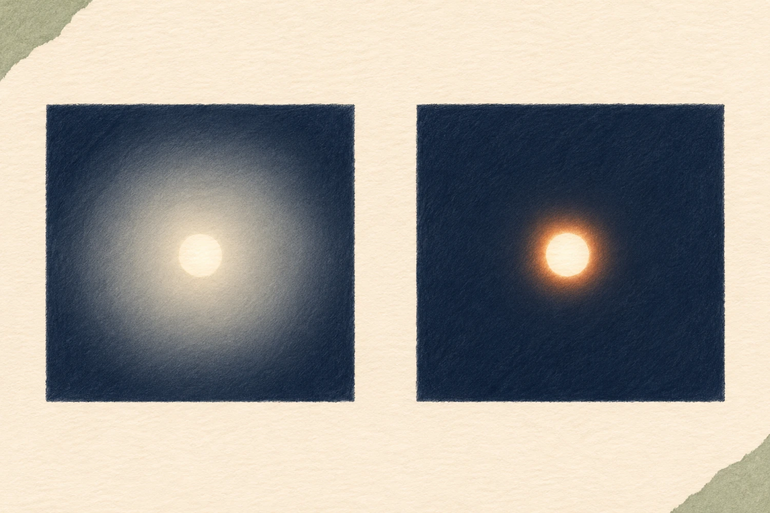
Bloom adds a bright glow that spreads outward from highlights. Consider it when you want a lamp to feel more luminous rather than simply appearing as a hard bright point. Look at its relationship with the surrounding space: does the spread support the setting, or make the nearby object’s outline harder to distinguish?
Halation wraps highlights in a warm red or orange glow, resembling film halation. Its defining distinction is not simply greater softness; it introduces a warm color character around highlights. That film reference describes a visual direction, not a guarantee of matching a particular film stock. Adobe’s Glow documentation gives both style definitions. 2
Compare them using the same photograph and intention. With the bottle example, ask whether Bloom’s spreading light already supplies the atmosphere you want. Consider Halation if a warm fringe genuinely serves the picture. A yellow lamp does not automatically make Halation the right choice: product colors and nearby skin still deserve attention.
Four controls help separate different decisions:
- Amount adjusts how much Glow you add. Use it to judge the effect’s overall presence rather than expecting it to solve every issue.
- Range determines which tones, or brightness levels, glow. Lower values keep the effect within the brightest highlights; higher values extend it to more tones.
- Spread controls how far the glow reaches from bright areas. Higher values make it wider and softer. Unlike Range, it concerns the reach of the glow rather than which tones participate.
- Warmth changes the glow’s cooler or warmer character. For Halation specifically, Adobe describes a shift from orange to red. 2
Change one control at a time and return to your two checkpoints. If too many surfaces participate, reconsider Range. If light from the lamp reaches too far, reconsider Spread. If the character is right but its presence is excessive, assess Amount. This is a way to diagnose a picture, not a fixed sequence of numerical settings.
Do not confuse those choices with Direction and Softness. Adobe’s table limits both controls to Motion and Streak, not Bloom or Halation. You do not need to find a light-trail angle control to distinguish the two styles discussed here. 2
Protect the details that still need to read clearly

Once you have chosen a style, stop judging atmosphere for a moment and check information. For a product photograph, read the name and variant, then inspect the outline of the cap or packaging. For a portrait, look at the cheek outline, backlit hair, and skin color near highlights. Is the effect helping you see the subject, or encouraging you to look only at the light?
View the whole image at its intended display size, then enlarge important areas. The larger view helps you inspect edges; the smaller view reveals whether the subject and text remain easy to recognize. An effect that seems restrained close up may feel less subtle in a thumbnail. Make the decision at more than one viewing scale.
Compare the image with and without added Glow while keeping other corrections unchanged. If the label becomes harder to read, reduce the part of the effect causing the problem. If a red-orange fringe distracts from product color, reconsider Warmth or try Bloom instead. Changing styles is a useful option; another adjustment is not always the answer.
Adobe also lists Glow presets in its release notes. Treat a preset as an opening suggestion, not approval for every photograph. Many small reflections create a different decision from a single lamp in the background. 3
Stop when the light supports the picture’s purpose without taking over important details. If balancing atmosphere and clarity still needs careful work, tell SCI Magie how you want to use the photograph and what must stay unchanged. A clear brief starts with the image’s needs rather than simply asking for “more glow.” Powered by Shaniba Creative Industry.
References: 1 — What’s new in Lightroom Classic; 2 — Retouch photos, Glow section; 3 — Lightroom Classic release notes.