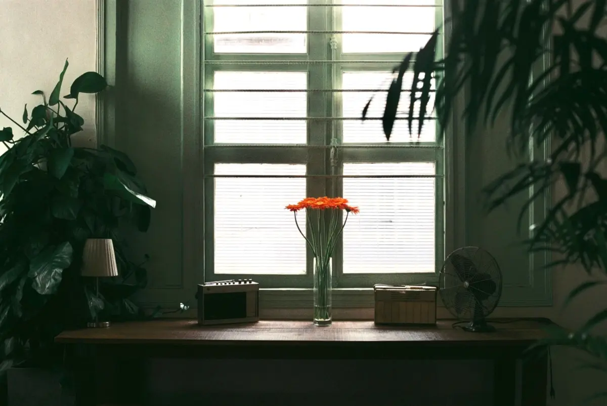
Picture a vase of flowers on a table beside a window. The tabletop looks bright enough, but the petals facing away from the light seem dim. Brightening the entire photograph might help the flower while making the table too prominent. Snapseed Selective offers a way to approach that uneven need through adjustments to a particular area rather than the whole frame.
The goal is not to make every petal equally bright. You want the darker folds to read more clearly while keeping the flower’s shape and its relationship with the vase and table believable. Before deciding how much brightness to add, work out where the adjustment should reach.
Opening photograph: phuong nguyen / Pexels, Pexels License; resized and WebP-compressed only. This stock image is not an app-test result.
Choose what should change and what should stay
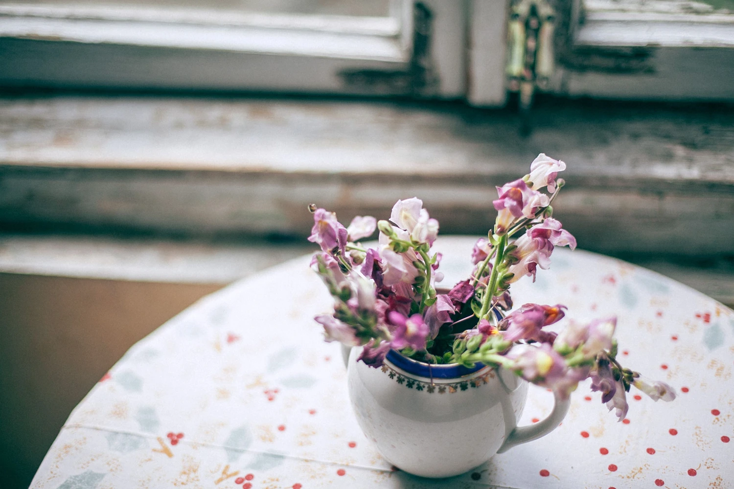
Look at the complete image first. Is everything too dark, or is one side of the flower noticeably harder to see? If the flower, vase, and table all need the same kind of correction, a whole-image adjustment may be a better starting point. A local adjustment makes sense when one part needs something different from its surroundings.
For this flower-on-a-table example, give yourself a specific aim: “Make the shaded petals easier to read without brightening the table.” That is more useful than simply deciding that the flower should look brighter. It gives you a reason to stop, and something concrete to check afterward.
Separate brightness from color intensity, too. A dim red petal does not necessarily need a more saturated red. Saturation changes how intense a color looks; this exercise stays with Brightness, the lightness or darkness of the selected area. Keeping one purpose makes it easier to understand what each change is doing.
Notice the petals already catching the window light. The difference between those surfaces and the shaded folds helps describe the flower’s curved shape. Removing every shadow can make that shape less convincing, even if the result initially looks brighter. A shadow is not automatically a flaw.
Identify three things before you begin:
- What needs help: shaded petals whose folds are difficult to distinguish.
- What should stay: the brighter petals, the flower’s color, and the tabletop’s existing balance.
- What needs watching: the vase edge, the stem, and shadows near the flower.
Keep the original photograph available for comparison. Rather than choosing a numerical setting in advance, judge whether the adjustment helps the intended area without distracting from its surroundings.
Check the Control Point’s reach in Snapseed Selective before raising Brightness
Google Help describes a Control Point as the point placed on the image area you want to adjust. Its instructions describe a pinching gesture that reveals the affected area as a red overlay and changes the size of that area.[1] The overlay is a preview of reach, not the finished appearance of the photograph.
Think of the point and its reach as separate decisions. The point identifies the location you have chosen. The preview helps you assess how far the adjustment extends. A point sitting on a flower is not, by itself, proof that the table or vase will be excluded.
Read that coverage before increasing Brightness. Does it include the dim petals you wanted to help? Does it extend toward a part of the table that already looks right? Avoid treating a circle around the point as a guarantee that every enclosed pixel receives an identical change. Equally, do not assume the selection will trace every petal edge perfectly.
If the reach seems too broad, reconsider its size or position. If it is too narrow, you may be addressing a small patch rather than the shaded section that needs help.
Once the reach makes sense, consider Brightness. Google Help defines it as lightening or darkening the selected area only.[1] Start with a small change, then judge the photograph without selection markers obscuring important details. No single brightness value can suit every flower, exposure, or lighting arrangement.
Compatibility note: these gestures are descriptions from Google Help, not verified instructions for a current device. The current App Store listing includes Selective and requires iOS 17 or later; interfaces may differ.[2] This is not a hands-on app test, and that listing does not establish Android requirements.
Review nearby areas, not just the selected point
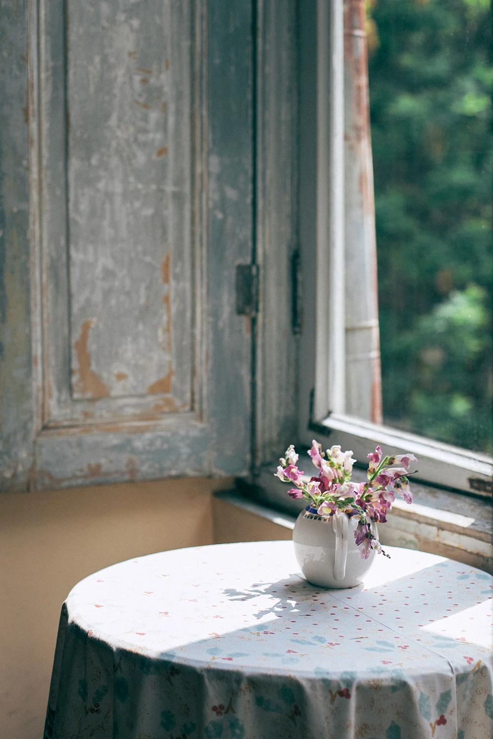
Once the flower looks brighter, check the neighboring petals rather than immediately calling the edit finished. Do they still have distinct folds? Has a previously delicate highlight become a pale patch? The transition from light to shade should still help you understand the flower’s shape.
Next, look away from the flower and toward the table. A surface that was already well balanced should not become the new focal point because of an adjustment intended for the petals. Check the shadows near the stem and vase base as well. Those relationships help the flower feel grounded in the scene.
Check the vase edge separately, especially if it is clear or reflective. You are not trying to remove every reflection, only checking that nearby areas have not changed for no useful reason.
Use this short review before keeping the result:
- View the whole photograph to check whether attention goes to the flower rather than a new bright patch.
- Look closer at petal folds and the boundaries beside the vase and table.
- Compare the original and adjusted image at the same viewing size.
- Reduce the adjustment if useful differences between light and shade start to disappear.
If the tabletop seems affected, resist adding more points simply to compensate. Return to the first choice: should its reach be smaller, its position different, or the added brightness lower? A simpler correction is often easier to judge than several adjustments trying to cancel one another out.
Stop when the shaded petals are easier to read and the surroundings still feel coherent. Increasing Brightness cannot guarantee the recovery of detail that was never recorded. The useful lesson is more modest: understand the reach of a local correction, then preserve the context that makes the photograph believable.
SCI Magie focuses on helping photographs look better while still feeling authentic.
SCI Magie — Powered by Shaniba Creative Industry.
References
[1] Google Help, “Selective”: https://support.google.com/snapseed/answer/6157827?hl=en
[2] App Store, “Snapseed: Photo Editor, Camera”: https://apps.apple.com/us/app/snapseed-photo-editor-camera/id439438619